Often, there can be so much focus on the visuals of an interface design that we lose sight of how a user will interact with it. Leaving something as crucial as this as an afterthought will inevitably lead to more work when issues are found post-launch.
In this article we will look at the importance of user testing and how keeping on top of it can improve your designs.
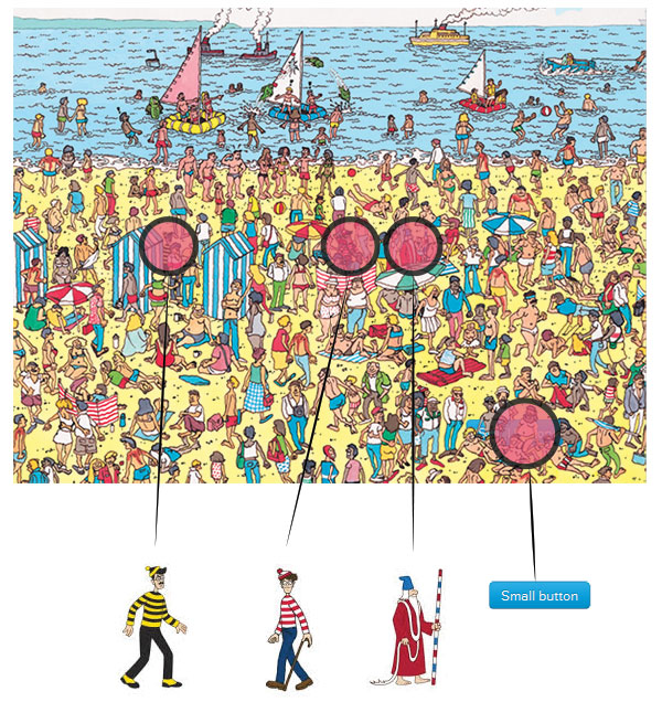
Where’s the button?
 “I’m in the picture somewhere!”
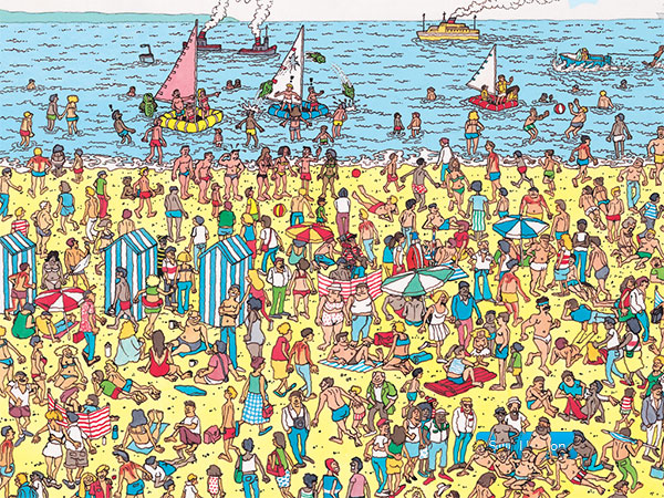
If you found it quickly well done you! If you’re still looking, hint: it’s not in the sea. If you have found it and are now trying to find Wally and Wizard Whitebeard, stop! You can come back later, there’s important user experience info below!
Okay so that was a bit of an excessive example but hopefully it has emphasised a point: don’t clutter your designs with unnecessary elements. Your calls to action should be clear and the user shouldn’t have to think about using them. It should be natural to them. There’s a simple way to make sure your design is optimised for your users; user test!
“The ability to simplify means to eliminate the unnecessary so that the necessary may speak.” ~ Hans Hofmann
I follow Luke Wroblewski on twitter; Luke is an expert in the field of UX, works with big brands and regularly speaks at conferences. He posted a set of four images on twitter that help to highlight how subtle changes to your user interface can have quite a result on your site metrics. They show not only the importance of testing your initial design, but to keep track of how your site/app is performing in the real world and where it could be improved.
Your first design may seem like a solution, but it is usually just an early definition of the problem you are trying to solve ~ Luke Wroblewski
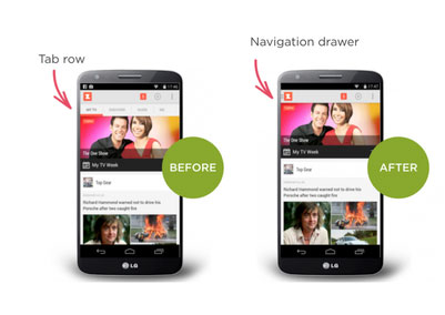
Image via Luke Wroblewski.
As this graphic shows, when the One Show changed to a ‘navigation draw’ to show and hide links –
- Engagement time halved
- Weekly frequency & daily frequency went down
- Time spent in app went down
Just from a change in menu structure! People don’t want to have to think, more and more our attention spans are shortening (stop thinking about where Wally is!).
“Our life is frittered away by detail. Simplify, simplify.” ~ Henry David Thoreau, Walden
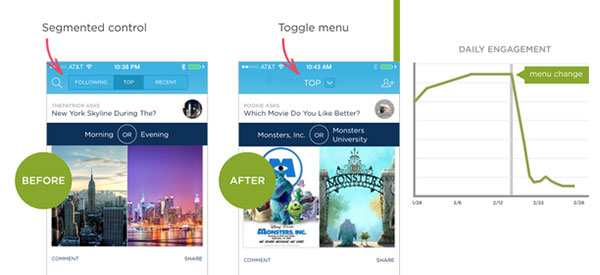
Image via Luke Wroblewski.
A great example of ‘Out of sight, out of mind’. As the the top links from the left image are changed to a dropdown in the right just look at the drop in user engagement.
A few more examples of ‘Out of sight, out of mind’.
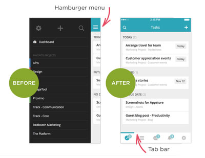
Image via Luke Wroblewski.
- Number of sessions more than doubled
- Session time increased 70%
- 65% increase in daily active users
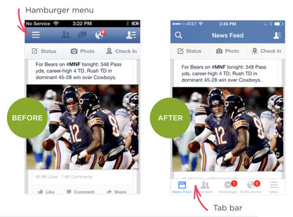
Image via Luke Wroblewski.
Better on:
- Engagement
- Satisfaction
- Revenue
- Speed & perception of speed metrics
These examples have focused around menu structures within mobile interfaces. They give a useful indication that users don’t like to think. That being said, I genuinely believe that as long as you hold the fundamentals of usability when designing, nothing is completely off the table until testing proves otherwise.
As you can see, ongoing testing can result in massive results for the performance of your product. As an example, when MTV had a responsive redesign of their news section, time spent on all devices was increased by 137%.
Planning
It’s best to sort out usability issues before you start a build by wireframing a structure as things will be much more time consuming to amend once a build is underway. Good UX examples tend to have a very clean design, only the elements that are ‘needed’ are used and filler is left out; since the coining of ‘mobile first’ design this has been particularly true. Try not to make the mistake of thinking that just because a design you create is clean it’s instantly going to be easy to use. If only it were that simple. Testing will show you if you have got it right. Furthermore let’s not forget that the user experience and associated user engagement metrics can also potentially impact SEO therefore there are knock-on effects.
Many web designers have an artistic background; due to this there can be a tendency towards the ‘look’ of a project. While of course that is an important aspect don’t let art and design courses fool you, the two are not the same thing. Web design has more restraints and structures in place and factoring these into a cohesive design is a skill in itself.
From the outset you should know if you’re targeting specific devices or creating a fully responsive experience that adapts to it’s device. If you have access to client’s user stats that’s a massive plus. If their website you are redesigning is mostly visited on mobiles then you’ll know to approach the design from a ‘mobile first’ perspective.
Mobile First
There have been many articles written on this subject, the main advantage to working this way is having limited screen space to work in so it forces you to only include what is necessary for the user; there isn’t the option to just put some content/elements in to fill space. This often improves usability and that will be the case when you scale up to desktop sizes too. Really though I think if you know where the site/app is likely to be used most, start there first with the principles of ‘mobile first’ in your mind.
Look what successful sites are doing
Keep your eyes open for what others are doing with design structures, awwwards is a good place to start; one of the criteria that they judge sites by is usability! The site is judged by top industry professionals so is a great source of knowledge.
Test, test, test!
As great as you may think a design is, if you create it in your own bubble you will inevitably miss usability issues. Always set up testing as milestones within a project timeline.
Important!
Think carefully about the project and also the intended audience and use. Sometimes there is a place for visually stimulating and unique page designs, but always consider the user experience.
Remember -
Art Asks, Design Answers
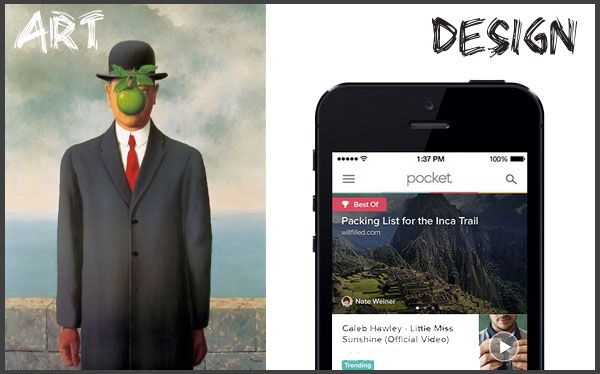
The eagle eyed of you will see the award winning app Pocket shown above uses a hamburger menu, but surely one of the examples earlier dismissed that technique?! No. User experience is all about testing and how elements function within ‘your’ design. Don’t think because something has been proven in one project and an element dismissed that this will still be the case on future projects. We are all becoming more tech savvy as days go by and a menu or button that has been dismissed before could work next time, just user test, you’ll soon find out.
It’s no surprise Fortune 500 companies hire people purely to test their apps/sites/products. User experience is a hugely interesting field and hopefully this article has given you an intro, our CRO section is a good place to head, now go find out more and –
Test!
“Clutter and confusion are failures of design, not attributes of information.” ~ Edward Tuft
Scroll down for Where’s Wally answers:
|
|
|
|
|
|
|
|
|
v


HI there. Just a small thing. I’d clicked on the first image of mobile screens as I couldn’t clearly see the differences - and the resulting image was no bigger than the original. Might be good to have larger images when you click?
thanks for the interesting article