This week we a look at Saucony’s microsite for the Kinvara 3 running shoe. As the winners of this award, they will be notified via Twitter by High Position Head of CRO, James Root (@RootToMarket) and will receive something from the coveted CRO Drawer. What did they do to deserve such an accolade? Read on…
Saucony Kinvara 3
WHAT DOES THE SITE DO?
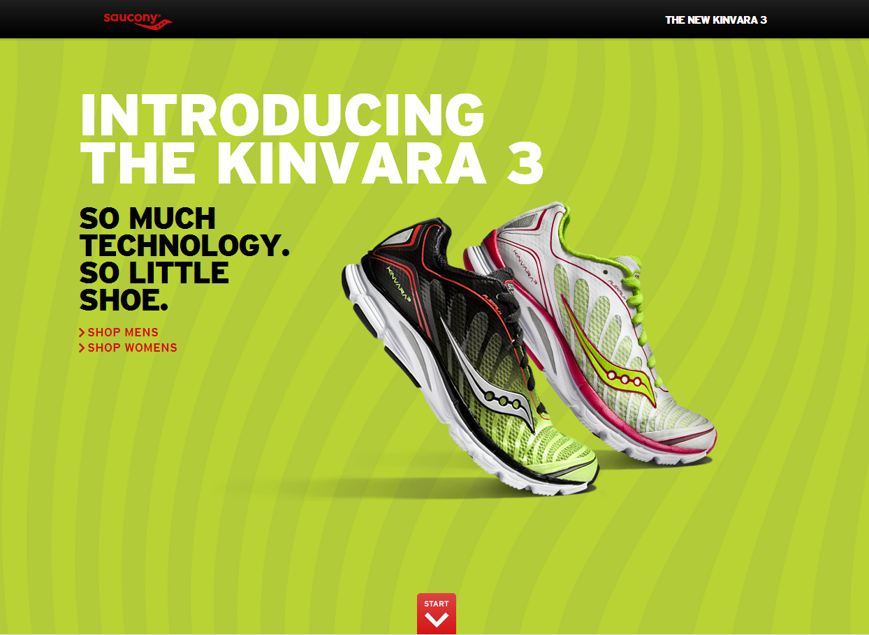
This is the microsite for Saucony’s “Kinvara 3”, one of their most popular running shoes. In a nutshell, this parallax, story-telling website offers an overview and breakdown of the technology behind the shoe.
WHAT DOES THE SITE SAY THEY DO?
“At Saucony, we exist for runners. Runners inspire us, bring us new ideas, force us to be better. They drive our design and engineering. They keep us competitive. They keep us hungry. They keep us honest.”…
“At Saucony, a good day is when we get to run. A great day is when we inspire someone else to run.”
WHAT DOES THE SITE DO WELL?
- Short, punchy headline including a memorable slogan at the beginning of the “journey”
- Vivid, acid green background, while eye-catching, actually harmonises with the product images to help them pop out of the page
- Using red for CTAs (green’s complimentary colour) means users just can’t miss ’em
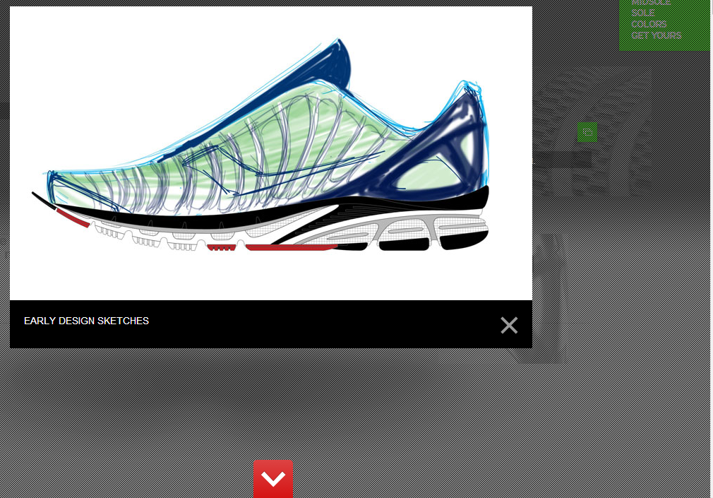
- The smooth animation into the first chapter of this story takes you to a predominantly grey backdrop with the flexible outer of the shoe taking pride of place in the centre of the screen.
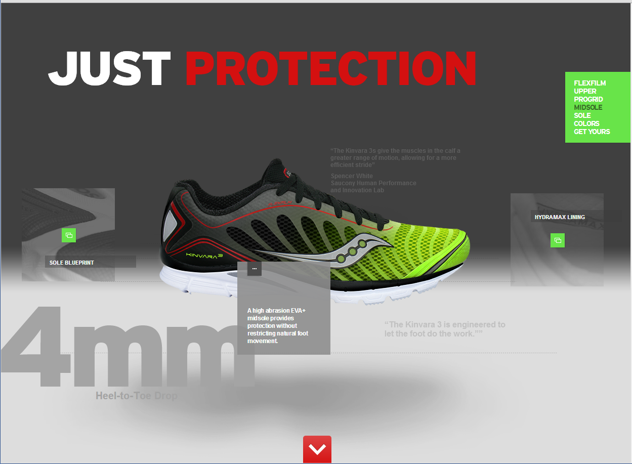
- Interactive elements on the page are highlighted using the familiar green from the previous page…
… and offer either more detailed explanations about the shoe or bold images
WHAT ELSE DOES THE SITE DO WELL?
- Each step through the site brings with it more detail, more images and snappy facts about the heel-to-toe drop and weight of the shoe, delivering a wealth of information in easily digestible chunks
- Quotes from experts involved in the project help validate the product and again provides the user with more information without overloading them with jargon
- The navigation on the right hand side of the screen means you can skip back and forth through steps without it taking away from the user experience
WHAT DOES THE SITE NOT DO WELL?
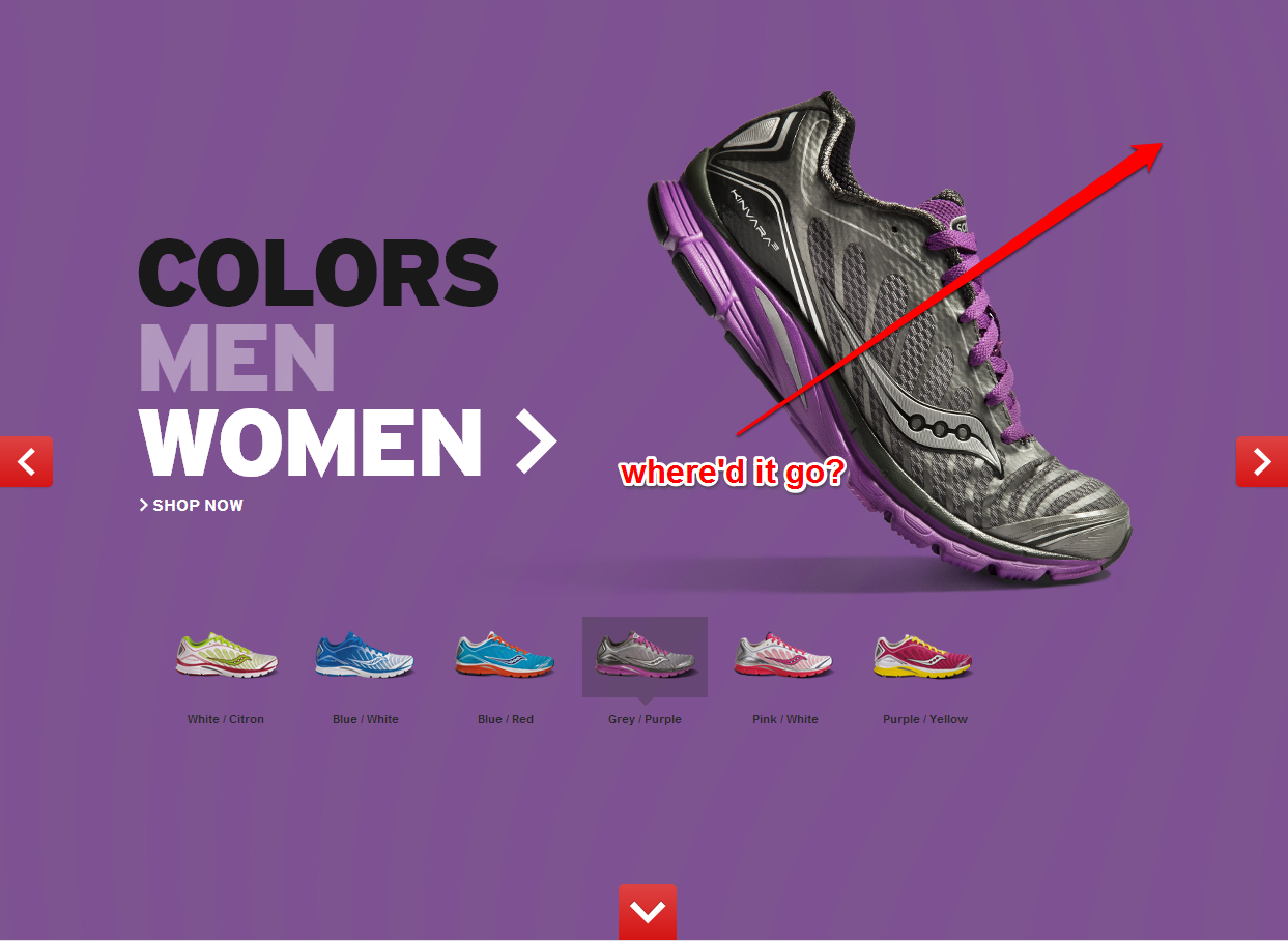
- The idea of the parallax effect is to fake a 3D website. The Kinvara 3 site’s interactive elements move with the mouse… away from the mouse… and I actually think it makes them more difficult to interact with. Not impossible, but by making those elements “move away” instead of “pop out” it’s clunkier than it should be. – TEST IT!
- That handy navigation on the right disappears during the final stages of the journey. Once you’re choosing your colour, you’ve no choice but to move to a sign-up page, and then start all over again. By keeping the navigation in place, users can continue to hop around and enjoy the ride – TEST IT!
This isn’t so much a test recommendation, but it is one of my pet hates on a website: Bad Grammar 
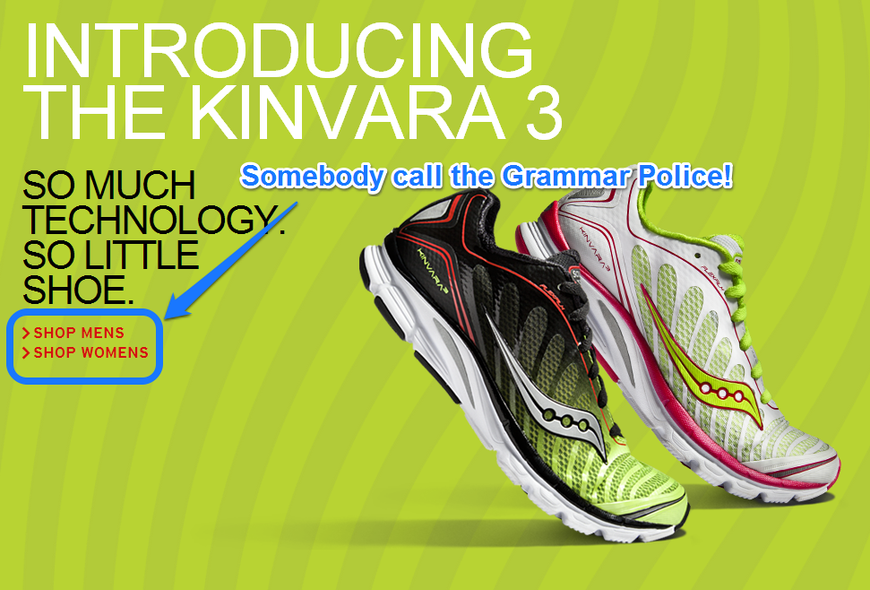

see?
*and breathe*
Huge congratulations, Saucony! The Kinvara 3 site is eye catching, fun to use and above all, engaging. You get some stuff from the CRO Drawer! #Win!
LIKE WHAT YOU’VE SEEN?

You can tweet your CRO Site of the Week nominations to @HighPositionSEO using the hashtag #CRONomination. We’d love to hear from anyone who’s come across a particularly fantastic website!