These days, there are so many ways your company can interact with the outside world and while the variation in methods often depends on your company’s purpose as well as your business model, the online form is one used by many if not all. You may want users to create an Account, perhaps you have an eCommerce Pathway or maybe you’ve just got a simple Contact Form. But encouraging your visitors to Sign Up, Get In Touch or just generally Hand Over Contact Details can be tricky business.
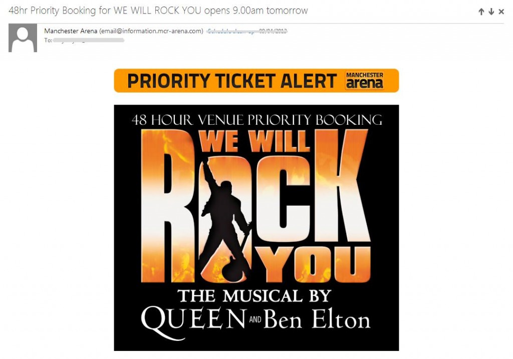
Gaining contact information from your visitors has obvious marketing benefits. You can send them promotions you’re running and add value to their experience by offering discounts on products similar to those they’ve already purchased. Amazon do this regularly, as do EVENTIM:
On an eCommerce site, Cookies work to enhance the customer experience by offering them other products and services inspired by their “recently viewed list”. By “listening” to them and adding to their satisfaction, they’re more likely to enjoy visiting your store and therefore become a loyal customer. Not only that, you’re gaining insight into what makes your target audience tick. You’re identifying your core market and so understanding what they want to see. Just like Google do!

This was the tweet sent by a Conservative MP after he tried to expose Labour for making money off a ‘Date Arab Girls’ link. Unfortunately for him, it was actually a targeted advert based on his search history… #fail
A form is far more transparent. You are asking users to submit information they deem personal and you (as a business) deem imperative. With such a lot riding on it, surely it’s worth making the effort and creating a form that WORKS.
Consider how sensitive the information you’re asking for is, and then how sensitive your user could be. What I mean is, this level of privacy differs in different situations and between different individuals. For example, there are cultural differences you could take into account. According to Hofstede, Collectivist cultures (read more about that here) are more inclined to protect information that differentiates them from the wider group. Individualist countries (such as UK) are more inclined to share.
Ask the right things at the right time. Jarrett and Gaffney, in their book “Forms that Work” point out that asking for information at the wrong time can have a negative effect on conversion. When you walk into a shop on the high street, are you greeted by a shop assistant demanding your method of payment? Nope. But when you get to the counter with what you want to buy, you’ll happily supply the details – you hand your card over.
So HOW do I ask?
Honesty
Be honest and explain WHY you want the information Gamberini, Petrucci, Spoto and Spagnolli found that if you tell your visitors you want to send them discount codes, promotional offers or event details that relate to products they’ve bought, services they’ve used or gigs they’ve been to, they’re more likely to give you their email address.
Integrity
Only ask for the information you need. Tim Ash stresses that asking the absolute bare minimum will also help instill trust. If your user wants to download a .pdf from your site… do you really need their postal address?
Aesthetics
Nathalie Nahai suggests using a subdued colour scheme on your forms as bright or garish palettes can look too sales-y or gimmicky and so do not instill trust. But don’t be afraid to use colour to make your form easier to use. Read about High Position’s tests on our own from. Also, assuring people that they won’t bombarded with third party promos means they’re less likely to think you’ll become irrelevant or irritating.
It’s the little things
Incentivise conversions by offering users discount codes or gifts for signing up now. Make the process quick and easy by only asking things once - I hate when I have to enter my billing information AND THEN my delivery information. What’s wrong with one of these?
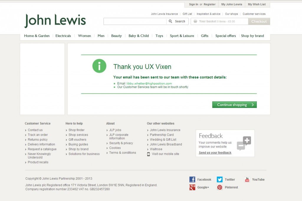
Also, a stylised, friendly thank you page wouldn’t go amiss:
John Lewis have an attractive Thank You page, a promise to respond quickly and a Call to Action so I am encouraged to continue browsing.
So when you’re designing your form, keep conversion in mind. It sounds obvious but really think about WHY you need the information you’re asking for. And ask yourself: “Would it be a disaster if I didn’t have this information?” … if the answer’s “No”, then maybe you shouldn’t even be asking - TEST IT!


