They may have taken some stick for bombing out of organic search results this week, but Ryanair deserves some credit when it comes to User Experience – and you don’t even have to pay to use their website!
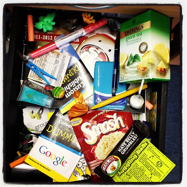
Putting the SEO faux pas to one side, this week High Position’s Marketing Manager, Rachael Bilby has crowned www.ryanair.com as winners of our CRO Site of the Week. As ever, winners of this prestigious award will receive something from the HP CRO Drawer. All winners will be notified by High Position Head of CRO, James Root via twitter: @RootToMarket. Nominations can also be tweeted so please share and get involved!
One of the UK’s leading providers of low-cost, no frills air travel, Ryanair historically has a reputation for bad user experience and “get what you pay for expectations”. From the garish blue and yellow homepage, to the idea of paying £1 every time you needed the loo in the air, does their new swishy site signify an end to the painful booking processes and poor customer treatment?
What does the site do?
Unsurprisingly the focus of the site is to sell flights and thankfully, most of the site is geared toward this. But, at no extra cost to the user, Ryanair have clearly made an effort to provide useful tools and information, with online check-in, a handy “news feed” and loads of other holiday add-ons: from car parking and hire cars to hotel bookings and weather updates.
What does the site do well?
Easy, no hassle, quick search tools
The main aim of the site is to book flights, so a prominent but tidy “Find Flights” form in the banner – next to an appealing £9.99 Sale box – is fantastic! The form itself really couldn’t get much easier to fill in either. With a handy pop out destination box to click on your airports, easy-select date boxes and one click “passenger” options for what is probably the most common travel options – in just a few clicks I was looking at flights!
Flight options are crystal clear and click friendly
If you don’t like what you’ve seen when it comes to price (Ryanair’s biggest USP) the alternative options are pretty damn clear, and if you want to “edit” and start again, it’s no trouble to search again – in the same page.
Easy to understand add-ons
Ok, so it would be nice to not have to pay for everything as extra – but Ryanair are clear that better service comes at a price. At least when you do add on the extras it’s easy and all in one place allowing you to chop and change your mind to get a price and service you’re happy with.
Lovely seat reservation tool!
If you’re paying up to £10 to reserve seats I should hope the reservation tool is hassle free – but it is possibly the best I’ve ever used! Damn – I want to reserve seats just for the fun of it!
Special Assistance doesn’t have to be Difficult
Planning ahead for special assistance sounds like it could ivolve a lot of organising but Ryanair make it clear and easy to request help – a “need extra help” box even pops up!
Quirky “Play to Win” option
A one click option to see if you have “won” your trip. Don’t mind if I do!
Intuitive Fare Finder Tools
Taking a step back – if you are stuck for inspiration or pricing, Ryanair have added some great tools to help find the right deal. With fancy sliders and a simple click functionality.
Ok, so I do love a graph, but could it get any easier to see which dates are the cheapest to fly? Simply hover over the bars to see the price and click to change your dates – easy! The “Book” button is pretty tasty too – putting the flight total in the button is a lovely idea.
Route Map
So, you know what airport you want to travel from but don’t know where you can fly to? Then this is perfect. The route planner is clean, easy to look at and has some great features, like zooming in and a “cheap flights from your airport” box for temptation.
Flight Info
If you need to quickly check in on delays on departures and arrivals then that’s easy too! The search function is minimalistic and you don’t even need to know the flight number!
Hotel Booking is pretty awesome too!
But, what could the site do better?
Well, like most sites, it isn’t perfect but there is a pretty big flaw in the Ryanair site…
What about mobile???
Getting the desktop site right is a massive achievement but it’s still a hassle when it comes to mobile. Let’s hope this is top of the list for the Ryanair web team!
All in all, this is an enormous improvement on the previous site and sets an example to other travel companies – the low-budget and the higher-end brands. The user has most definitely been thought about here – even if the search engines haven’t!
Hats off to Ryanair – but the lack of attention to mobile is a little disappointing, I just hope they have something up their sleeves for this!
As the winner of this week’s CRO Site of the Week, you’ve won yourself some stuff from the CRO drawer – look out for a package in the post!


