This week High Position’s CRO Expert Laura - Super - Hands takes a look at River Island’s website. As ever, winners of this prestigious award will receive something from the HP CRO Drawer. All winners will be notified by High Position Head of CRO, James Root via twitter: @RootToMarket. Nominations can also be tweeted so please share and get involved!
RiverIsland.com
WHAT DOES THE SITE DO?
Sells Men’s and Women’s high street clothing.
WHAT DOES THE SITE SAY THEY DO?
It doesn’t! The site assumes that the visitor is familiar with the brand.
WHAT DOES THE SITE DO WELL?
Product Pages
- Very clear, logical layout and obvious call to action button
- Excellent zoom function allowing for very detailed assessment of the products
- “Wear it with” feature displaying other items that compliment the product being viewed
- Unique and concise product descriptions and easy to digest delivery and returns information
CATEGORY PAGES
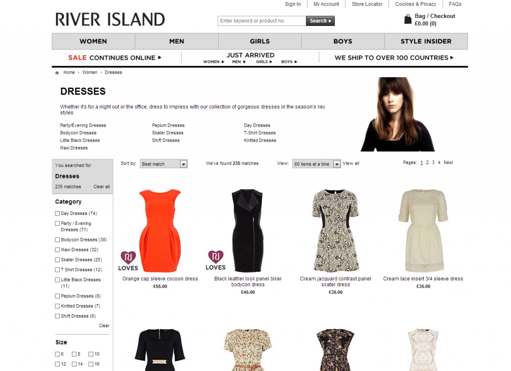
- Ability to scroll over the items and view them displayed on a mannequin. This allows the shopper to better determine whether they like the product or not before clicking through to the product page
- Limited Edition product tags – encourages a feeling of scarcity
- Very clear product gallery – product images are excellent quality, showcasing the items effectively
What else does the site do well?
- Innovative “get the look” feature which separates products into different collections providing outfit inspiration in a magazine-style layout
- Exceptional social media presence – huge social media following due to consistent and engaging use of Facebook, Twitter, Pinterest, YouTube and Google+
- “You’ve just seen” element showcasing the last 10 products viewed. This saves the viewer from having to search for something they previously looked at
What does the site not do so well?
- Social media buttons are hidden at the bottom of each page. Would these get more interaction placed somewhere more prominent? TEST IT!
- No guest checkout option. In order to make a purchase you have to create an account. Would more people make sales if they did not have to sign up? TEST IT!
- The mouse over function on the category pages does not work for all images giving a slight feeling of inconsistency. TEST IT!
- The colour of the mannequins is white making them slightly unclear against the white background. Would more visitors click through to the product details if these issues were addressed? TEST IT!
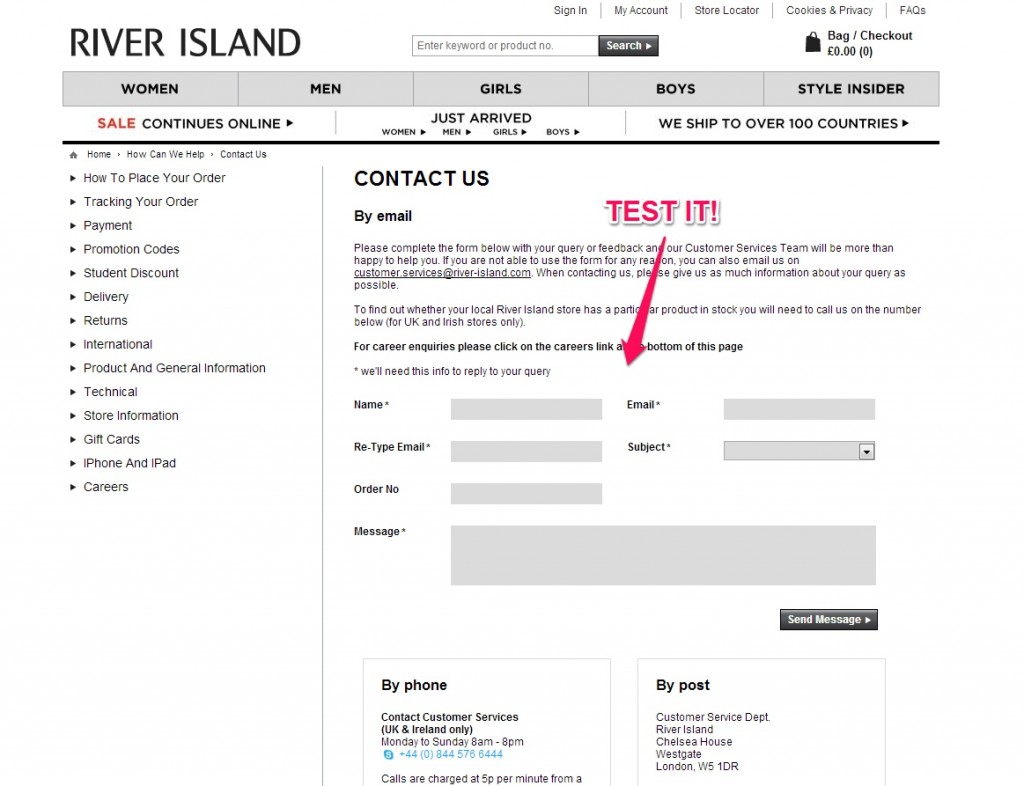
- Contact us form is uninspiring. Would more people make use of it if it featured less text and a more prominent call to action? TEST IT!
Tweet your CRO Site of the Week nominations to James – @RootToMarket. And remember: If you Test it; they will come!
Each winner receives some stuff from James’ drawer! #Win!


